How to Measure Content's Influence on Pipeline (Not Just Downloads)
Content-influenced pipeline is the total value of open opportunities where a buyer engaged with your content before or during the deal. You measure it by connecting content engagement data to CRM opportunities, applying an attribution model, and reporting it separately from content-sourced pipeline.
Introduction
Picture the Monday content review. Your dashboard shows 4,000 blog visits last month, a case study with 200 downloads, and a comparison guide that's suddenly your third-highest traffic page. Everyone nods along. Then someone from sales leans forward and asks the question that ends the meeting early: "Okay, but did any of that help us close anything?"
You don't have a number. You have a hunch, and a hunch doesn't survive a budget review.
That gap between "content is working" and "here's proof it moved a deal" is where most content teams lose the budget argument, and it's exactly what this guide fixes. You're going to learn how to measure content's influence on pipeline: not vanity traffic, not download counts, but the dollar value of opportunities where your content actually showed up somewhere in the buying journey. Teams with tight sales and marketing alignment tend to see meaningfully faster revenue growth than teams pulling in different directions, and a defensible pipeline number is usually the thing that finally gets both teams looking at the same data instead of arguing about whose dashboard is right.
This isn't a theory piece. It's the build sequence, in order, using whatever CRM and marketing stack you already have. No new platform is required to get started, and nothing here assumes a data team standing by to build custom pipelines. It's the same sequence a lean content team of two or three people can work through over a quarter, one step at a time.
What Is Content-Influenced Pipeline?
Content-influenced pipeline is the dollar value of every open opportunity where a buyer, or anyone else on the buying committee, engaged with a piece of your content at some point before the deal closes. It doesn't matter who technically "owns" the lead or where the deal originated on paper. If content touched it, content gets counted.
That's a deliberately broad definition, and it needs one more layer before it's actually useful: a qualifying touch. Not every scroll counts. A four-second glance at a blog title in a Slack link preview is not the same signal as a buyer spending six minutes on your pricing page and then forwarding it to a colleague. You'll define your own qualifying-touch rules in a few sections, but the concept matters right now because it's what separates a credible metric from a number nobody on the sales team will ever trust. A dashboard built on generous, undefined "engagement" collapses the first time a rep asks "wait, what actually counts as a touch?" and nobody has an answer ready.
Content-Sourced vs. Content-Influenced Pipeline
Here's the distinction that trips up most first attempts at this metric. Content-sourced pipeline credits content only when it's the very first touch that started the deal. A prospect reads a blog post, fills out a form, and that becomes an opportunity in your CRM. It's clean, it's easy to track, and it's also incomplete, because it ignores everything content does after that first form fill.
Content-influenced pipeline is the broader, more honest number. It counts any opportunity where content played a role at any stage, regardless of who or what technically originated the deal. A rep-sourced enterprise deal that later got unstuck because the champion shared your comparison guide with their CFO still counts as content-influenced, even though content never touched the top of that funnel at all. Report both numbers side by side, and never blend them into one figure. A board member asking "did content start this, or did it just show up somewhere along the way" needs a different answer for each question, and giving them one merged number quietly answers neither.
Why This Metric Matters More Than Page Views
A blog post with 50,000 monthly views and zero pipeline touches is, bluntly, a vanity asset. A comparison page with 400 views a month that keeps appearing in your highest-value deals is a revenue driver. Without a way to tell those two apart, you'll keep funding the wrong one, because the traffic dashboard will always make the popular post look like the winner, and it's lying to you in the friendliest possible way.
This is also the number that determines whether your team's budget grows or shrinks next quarter. For B2B SaaS companies, revenue enablement programs that connect content, training, and pipeline data typically find that content-influenced pipeline represents somewhere between 40 and 60 percent of total pipeline value. That's not a number to quote as gospel in your own board deck, since your mix will vary by sales motion and deal complexity, but it's a useful gut check. If your dashboard says content touches 5 percent of pipeline, either your tracking is broken somewhere, or your content strategy has a real problem worth investigating.
One SaaS team that unified their UTM tagging, standardized a content taxonomy, and layered in a position-based attribution model saw influenced pipeline climb 36 percent while sales cycle length dropped 14 percent. Not because they made more content, but because they could finally see which four guides were doing the actual heavy lifting and reallocated budget away from everything else. That's the "so what" behind clean measurement: it doesn't just prove content works, it tells you which content to make more of and which to quietly retire.
The ROI math behind that kind of shift is straightforward once the tracking is in place. If a $100,000 content investment surfaces $500,000 in influenced pipeline, that's a 4x return, and that's the sentence that gets a content budget approved for another year instead of trimmed. Getting to that sentence honestly, without inflating the numbers or hand-waving the attribution, is the rest of this guide.
This isn't a problem unique to any one team, either. Most established sales enablement platforms have built entire product lines around answering exactly this question, tying content usage data to deal progression so revenue leaders stop having to guess. That's a useful signal in itself: when an entire product category exists to answer "did this content actually help," it's a strong sign the question is worth taking seriously long before you've bought any tooling to help answer it.
What You Need Before You Can Measure Anything
Before you touch a dashboard, three things need to be in place. Skip any of these and your numbers will look precise while being quietly wrong, which is worse than not measuring at all.
Consistent UTM tagging. Every content touchpoint, whether it's a web link, an email, or a link a rep shares directly with a buyer, needs a UTM structure applied the same way every single time. A naming convention like content_[assettype]_[topic]_[funnelstage] sounds tedious until you try to report by content cluster six months from now without one and realize half your traffic is unattributed.
A content taxonomy. Standard names for asset type, topic, and funnel stage, stored consistently in your CMS and marketing automation platform. This is what content tracking actually depends on underneath the dashboard. Without a taxonomy, you can report on individual URLs but never roll them up into "which topic cluster is driving pipeline," which is the question leadership actually asks in the review meeting.
Contact-to-opportunity association in your CRM. An anonymous content view is worthless on its own. It only becomes useful once it's tied to a named contact, and that contact is reliably tied to an open deal. This is usually the piece that takes the longest to set up properly, largely because it depends on how clean your CRM data already is, and it's also the piece you genuinely cannot skip.

How to Measure Content's Influence on Pipeline: Step by Step
With the groundwork in place, here's the sequence, in order. Define what counts as a touch, connect that data to your CRM, pick an attribution model, build a dashboard people actually trust, validate it against a control group, then review it on a rhythm that matches how fast your pipeline actually moves.
Step 1: Define What Counts as a Qualifying Touch
Write the rule down before you write any code or configure a single dashboard filter. Decide which asset types count (probably not a homepage visit, almost certainly yes to a case study or comparison guide), what engagement threshold applies (a four-minute read is not the same signal as a two-second bounce), and what lookback window you'll use. Ninety days works well for shorter sales cycles. A 180-day window fits longer enterprise deals more accurately.
Different asset types need different thresholds, too. A prospect who watches 80 percent of a product demo video is showing real intent in a way a simple page scroll can't capture, which is why teams that track video engagement separately from static content tend to get much cleaner signal on late-stage buyer interest. Treating a video view and a blog scroll as identical events is one of the fastest ways to make your dashboard look busy and mean very little.
Step 2: Connect Content Engagement to CRM Opportunities
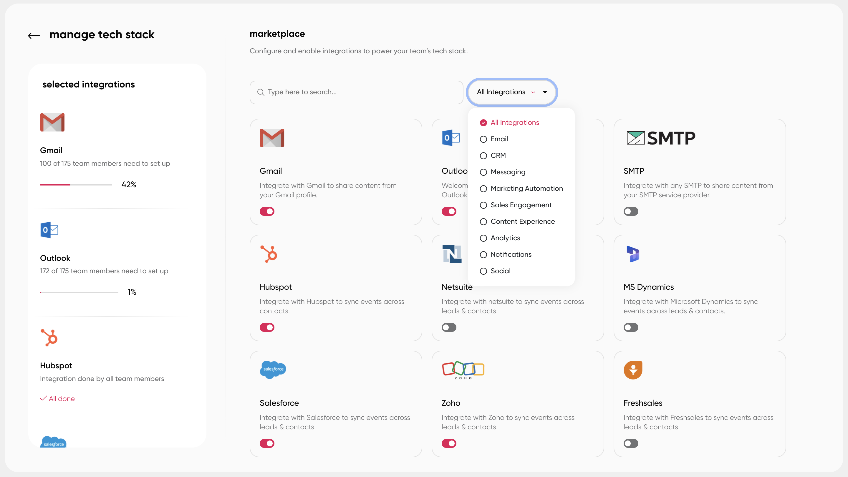
This is the step where the metric either becomes real or stays a spreadsheet exercise nobody updates past the second month. Every qualifying touch needs to land on the contact record, and every contact needs to be reliably associated with an open opportunity, whether you're running Salesforce, HubSpot, or something else entirely. If a rep shares a case study directly from your content platform, that share, and everything the buyer does with it afterward, should sync back to the opportunity automatically. Manual logging doesn't scale past a handful of deals a month, and the moment it becomes a manual chore, reps stop doing it.
Step 3: Choose an Attribution Model
There's no single correct attribution model for content, only the one that answers the question you're actually asking. First-touch and last-touch are the easiest to set up and the easiest to get wrong for this specific metric, because they systematically undervalue the mid-funnel content that's usually doing the real convincing. A full comparison of the five common models sits right after this section.
Step 4: Build a Dashboard Sales Actually Trusts
Report content-influenced and content-sourced pipeline as two separate lines, never combined into one blended figure. Break it down by content cluster, not just by individual URL, so the dashboard suggests what to create next rather than only narrating what already happened. The same instinct that drives teams to track KPIs for a digital asset library applies just as directly here: a dashboard nobody can act on is just a more expensive spreadsheet with better colors.
Step 5: Validate With a Cohort Comparison
Pull a control group: deals with no qualifying content touches, matched roughly by deal size and segment. Compare win rate and sales cycle length against your content-influenced cohort. This is the step most teams skip entirely, usually because it takes an extra week of analysis, and it's also the step that turns "content seems to help" into a number you can defend when someone on the finance team pushes back with "correlation isn't causation." Even a rough cohort comparison, run once a quarter on the last ninety days of closed deals, is enough to catch a claim that doesn't hold up before it ends up in a board deck.
Step 6: Review Monthly, Govern Quarterly
Weekly reporting on this metric is mostly noise. There isn't enough deal movement week to week to draw a real conclusion, and chasing weekly swings will send you chasing the wrong signal. Monthly is the right cadence for spotting trends, and quarterly is when you actually decide what to fund, what to retire, and what needs a rebuild. Treating this on a fixed cadence, the same way enablement best practices recommend reviewing any recurring program, is what keeps the metric from becoming a one-time report that gets built once, presented once, and never opened again.
Attribution Models Compared
Every attribution model answers a slightly different question, which is exactly why picking one without first knowing which question you're asking is how most attribution arguments start in the first place.
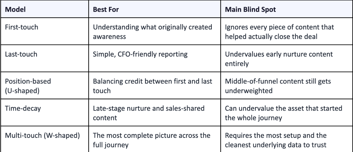
Most teams that get this right don't pick one model and stop there. They run two in parallel: time-decay for velocity questions (is content speeding deals up?) and position-based for influence questions (how much of this pipeline actually touched content?), and they compare the two rather than quietly averaging them into one number that answers neither question well.
Common Mistakes That Break Content-Influenced Pipeline Reporting
Even with the framework above fully in place, a handful of habits quietly undermine the number over time.
Blending sourced and influenced into one figure. The moment you combine them, you lose the ability to answer either question cleanly, and the first person who asks "wait, which is this" will stop trusting the entire dashboard, not just that one metric.
No lookback window. Without one, a touch from 18 months ago is still claiming credit for a deal that closed last week, which inflates the number in a way that eventually gets noticed and undermines everything else you report.
Treating one attribution model as gospel. Every model has a blind spot by design. Comparing two tells you more about what's actually happening than perfecting one ever will.
Letting stale content skew the numbers. An outdated one-pager still gets shared occasionally, still gets logged as a touch, and quietly drags your influence rate in a direction that doesn't reflect what your current content library actually does. Retiring dead assets on a regular schedule is part of measurement hygiene, not a separate housekeeping project to get to later.
Reporting the number without the story behind it. A single influenced-pipeline figure in a slide deck invites skepticism. Pairing it with the two or three specific deals it came from, and the specific assets involved, is what actually changes minds in a budget meeting, because it turns an abstract percentage into something a skeptical VP can picture happening in their own pipeline.
Where Paperflite Fits In
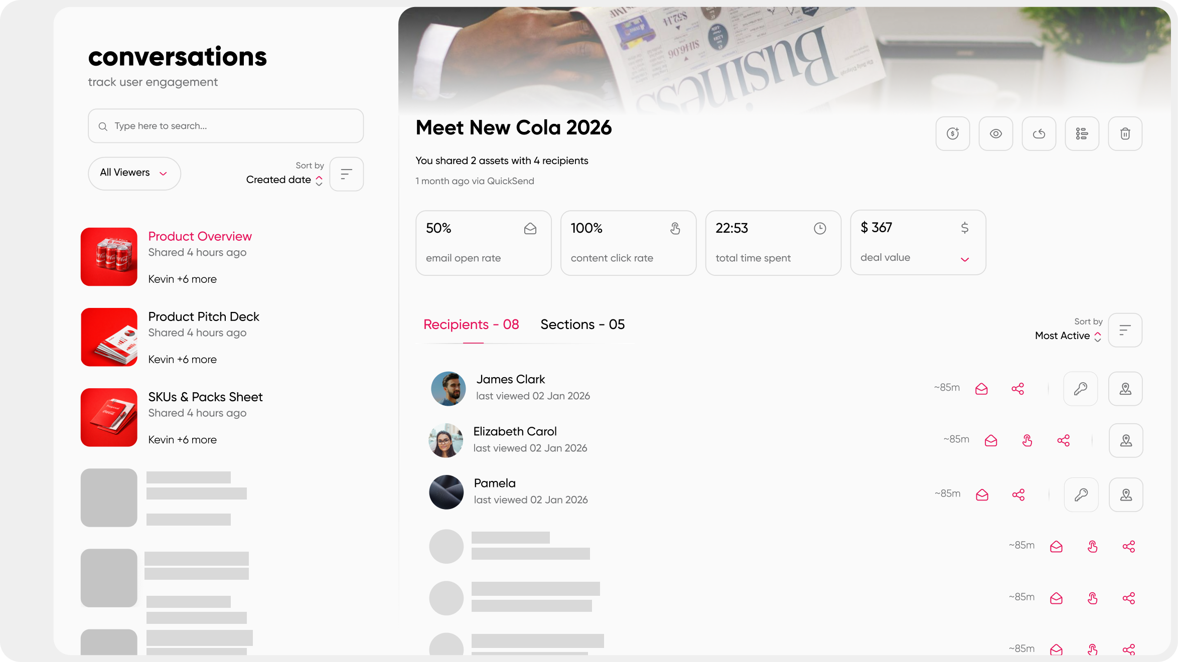
Steps 2 and 4 above are usually the two that stall a content team's measurement project, and not because the concept is hard to grasp. The plumbing is just tedious to build from scratch, especially the sync between content engagement and CRM opportunity records. Paperflite closes that gap on the content teams actually control day to day. Instead of leaving reps to email a PDF and hope, content shared through Paperflite goes out as a trackable, personalized microsite tied to a named contact, so every view, forward, and page-level engagement is attributed to that buyer from the first click, not reverse-engineered later through UTM matching.
Deal Insights then rolls that buyer-level activity up against the deals that actually close, not just the ones where content happened to get opened, and native sync with Salesforce and HubSpot means it lands in the opportunity record without a custom integration project, which is the part of Step 2 most teams underestimate until they're three months into building it themselves with an engineer borrowed from another team.
None of that replaces the framework above. It just removes the months of internal tooling most teams would otherwise need to build before they could start using it at all.
Conclusion
Content-influenced pipeline isn't a reporting trick, and it isn't solved by buying a new dashboard tool and hoping the number improves on its own. It's a data foundation problem, solved in a specific order: get your taxonomy and UTMs consistent, connect engagement to CRM opportunities, pick an attribution model on purpose rather than by default, build a dashboard people actually check, and validate it against a control group before you put it in front of leadership. Do those five things in sequence, and the number stops being a hunch defended in a hallway conversation and starts being something sales genuinely believes.
FAQ
What's considered a good content-influenced pipeline percentage?
For most B2B SaaS teams, content-influenced pipeline lands somewhere between 40 and 60 percent of total pipeline value, though this varies significantly by sales motion and deal complexity. Treat published benchmarks as a sanity check rather than a target to hit.
How do platforms like Highspot or Seismic measure this differently from a DIY setup?
Both tie content engagement to CRM opportunity data through native integrations and built-in dashboards. The real difference usually comes down to how much custom reporting work is needed to roll individual content events up into a full revenue view, rather than whether the underlying data exists in the first place.
Does content-influenced pipeline include organic search traffic?
Only if that visit is tied to a specific tracked asset and later connects to a known contact and opportunity. Anonymous organic traffic that never resolves to a person doesn't count toward this metric, no matter how much of it there is in your analytics tool.
Do I need a customer data platform, or is CRM plus marketing automation enough?
For most teams, a CRM and marketing automation stack with clean UTMs and reliable contact-to-opportunity association is enough to get started. A CDP becomes genuinely useful once you're stitching signal across many disconnected tools rather than a core two or three.
How often should content-influenced pipeline be reported?
Monthly for trend visibility, quarterly for budget and content strategy decisions. Weekly reporting on this particular metric usually just adds noise, since there isn't enough deal movement in a single week to draw a reliable conclusion.
What lookback window should I use?
Ninety days works well for shorter sales cycles, while a 180-day window fits longer enterprise deals more accurately. Match the window to your actual average sales cycle length rather than defaulting to a fixed industry number you found somewhere else.
Can content-influenced pipeline double count across channels?
Yes, and that's expected rather than a bug in your setup. If a deal had both a content touch and an event touch, both channels can legitimately claim influence. Publish a short overlap note next to your dashboard so leadership doesn't assume the numbers are meant to sum to 100 percent.
How do I get sales to trust these numbers?
Show individual deals, not just the aggregate figure. When a rep can see exactly which asset a specific buyer engaged with before a stage change, the metric stops feeling like a marketing claim and starts feeling like a fact about their own pipeline that they can verify themselves.