How Grammarly Hit 30% Conversion Rate with an Interactive Report Using Cleverstory
Annual reports are not supposed to be addictive, but this one is.
Grammarly took a research-heavy story and rebuilt it as an interactive report with Cleverstory. The experience feels like a product tour instead of a static PDF. It is fast to skim when you have 90 seconds, deep enough to reward a 20-minute dive, and designed to convert genuine
curiosity into conversations with the team. This post does not retell the findings. It shows how the experience was made, why the choices work, and how you can create interactive reports that people actually finish.
The Backstory And The Crew That Shipped It
Every strong content experience begins with a simple question. What if our report matched how people really read today? On a phone? Between meetings?In short bursts? Grammarly set out to answer that question for its annual report with a small group that carried clear roles.
- Grammarly owned the narrative and editorial spine. The team mapped which ideas matter to leaders and the order in which those ideas land.
- Harris Poll provided the methodology and research rigor. That gave the story weight and credibility while keeping the main journey uncluttered.
- Cleverstory, built by Paperflite, provided the no-code canvas. Smart Gating for value first access. Interactive blocks for tabs, sliders, and micro reveals. Footprints analytics to see what actually resonates once readers are inside.
There were strict constraints from the start. Stay precisely on brand. Avoid long engineering queues. Make iteration part of the plan. That is the lane where Cleverstory performs well. The editor, templates, and analytics allowed Grammarly to move quickly without compromising design quality or compliance.
This project shows how Grammarly partners with Cleverstory to ship interactive reports quickly, stay on brand, and measure what resonates.
See how Cleverstory helps you turn long reports into experiences people engage with
From Static To Playable
A static report is a long scroll and a quiet hope that the reader keeps going. A playable report is a chaptered journey with a visible sense of progress and clear next steps. Grammarly chose the second path. The architecture is simple and intentional.
- Chapters rather than pages. Each chapter covers a focused theme. You can jump in anywhere and still understand the full story.
- Micro interactions such as tabs, reveals, sliders, and accordions. These compress complexity into calm. Instead of dumping everything on one page, readers pull the depth they want.
- Value first access with Smart Gating. Let readers experience the substance. Ask for details later, when intent is clear.
- Brand-safe design system. Color, type, spacing, and imagery lock to Grammarly guidelines. That allows speed without risk.
- Performance and accessibility as defaults. loaded infographics. Descriptive alt text. Motion with captions. Keyboard-friendly interactions.
This is how you create interactive reports without the pain of a custom build. It is also why this format works for interactive annual reports, interactive business reports, and other long form assets that usually suffer from low completion.
Section By Section: What Readers Experienced And How It Was Built
This breakdown focuses on features and interaction patterns. It shows how Grammarly used Cleverstory and a few smart editorial decisions to make each section do its job.
Opening snapshot
What readers experienced: a clear promise in one breath, followed by a compact carousel that previews the major chapters. There is a sticky progress cue so readers know the journey is manageable. The first screen answers the question busy leaders always ask. Why should I care right now.
How it was built: a hero block, a row of cards that deep link into chapters, and anchored navigation that keeps the progress bar in view. Copy is short, verbs are active, and the next best action is always visible.
Why it works: readers decide in seconds whether to commit. This opening lowers the commitment threshold while giving a real taste of value. It sets the tone for the entire interactive report.
Pillar 1. Compliance
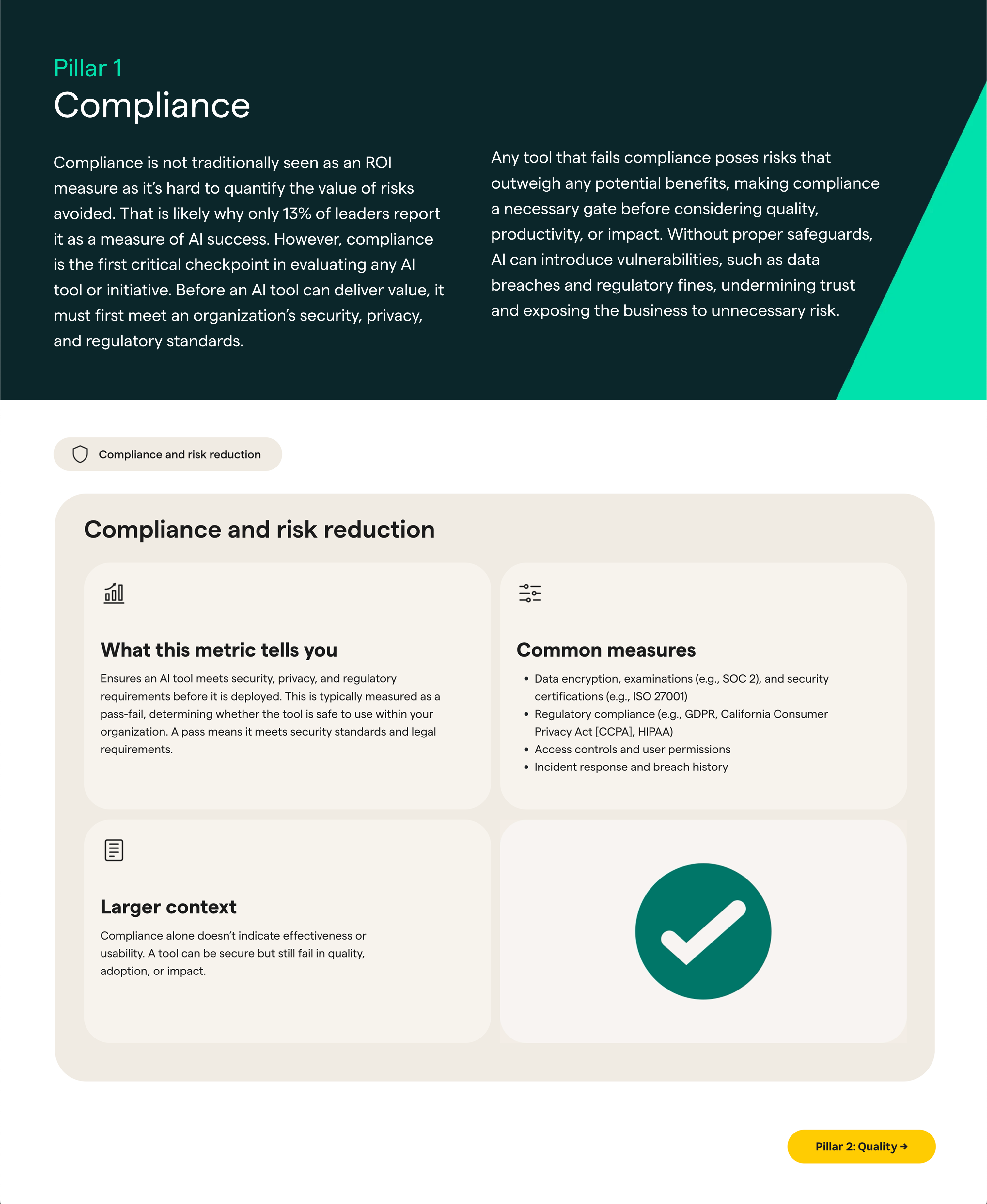
What readers experienced: a clean interactive checklist that covers privacy, security, governance, and responsible use. Hover notes decode acronyms. Drawers expand for short examples. A small panel called why this matters ties the checklist to practical situations without sounding like legalese.
How it was built: accordions for sections, tooltips for terms, and a side drawer for examples that do not force a reload. Anchors return the reader to the top of the checklist so they never lose context.
Why it works: compliance content often slows momentum. This pattern turns it into forward motion by making the rules scannable and the meaning obvious. It shows that interactive business reports can be friendly and rigorous at the same time.
Pillar 2. Quality
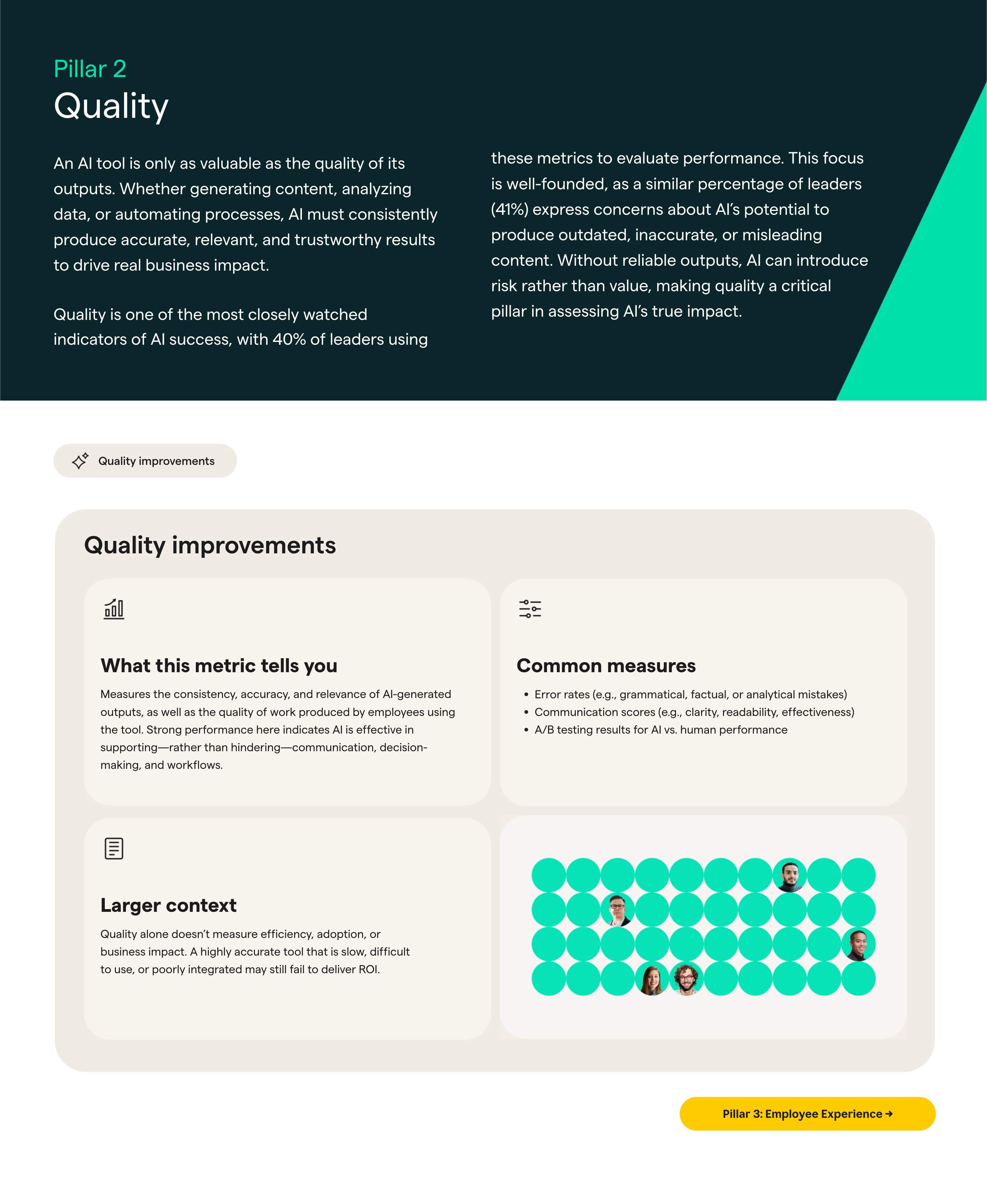
What readers experienced: a before and after slider that contrasts generic output with quality guarded output. Side tabs switch scenarios such as a customer email, an internal memo, or a support response. Inline definitions keep terminology consistent without sending readers to a glossary.
How it was built: a slider component for the visual moment of truth, a tab component for quick scenario switching, and inline notes for precise terms.
Why it works: quality is a fuzzy idea until you can see it and feel it. The slider forces a five second confrontation with reality. It is one of the most effective interactive report examples because it replaces a claim with a tactile proof.
Pillar 3. Employee experience
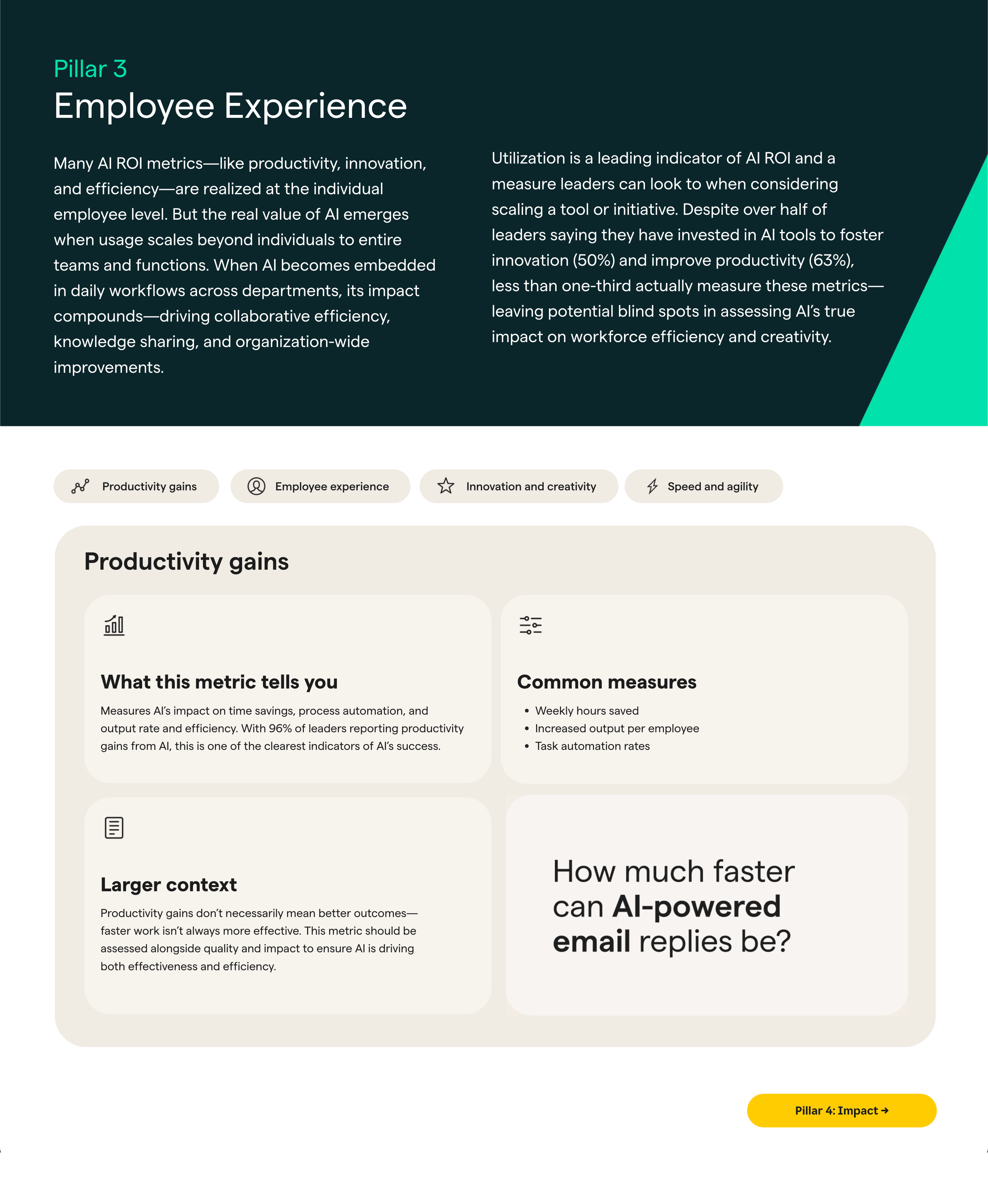
What readers experienced: short day in the life storyboards that show how tasks shrink and context switching drops. Optional audio clips, with captions, give the sequence a human tempo. Small chips labeled try this next route leaders and practitioners down different paths.
How it was built: media cards with short video or audio, captions for accessibility, and journey chips for role based routing.
Why it works: Joy is subjective. You cannot assert it and hope to be believed. The report shows it instead. That is the kind of evidence busy teams respond to.
Pillar 4. Business impact
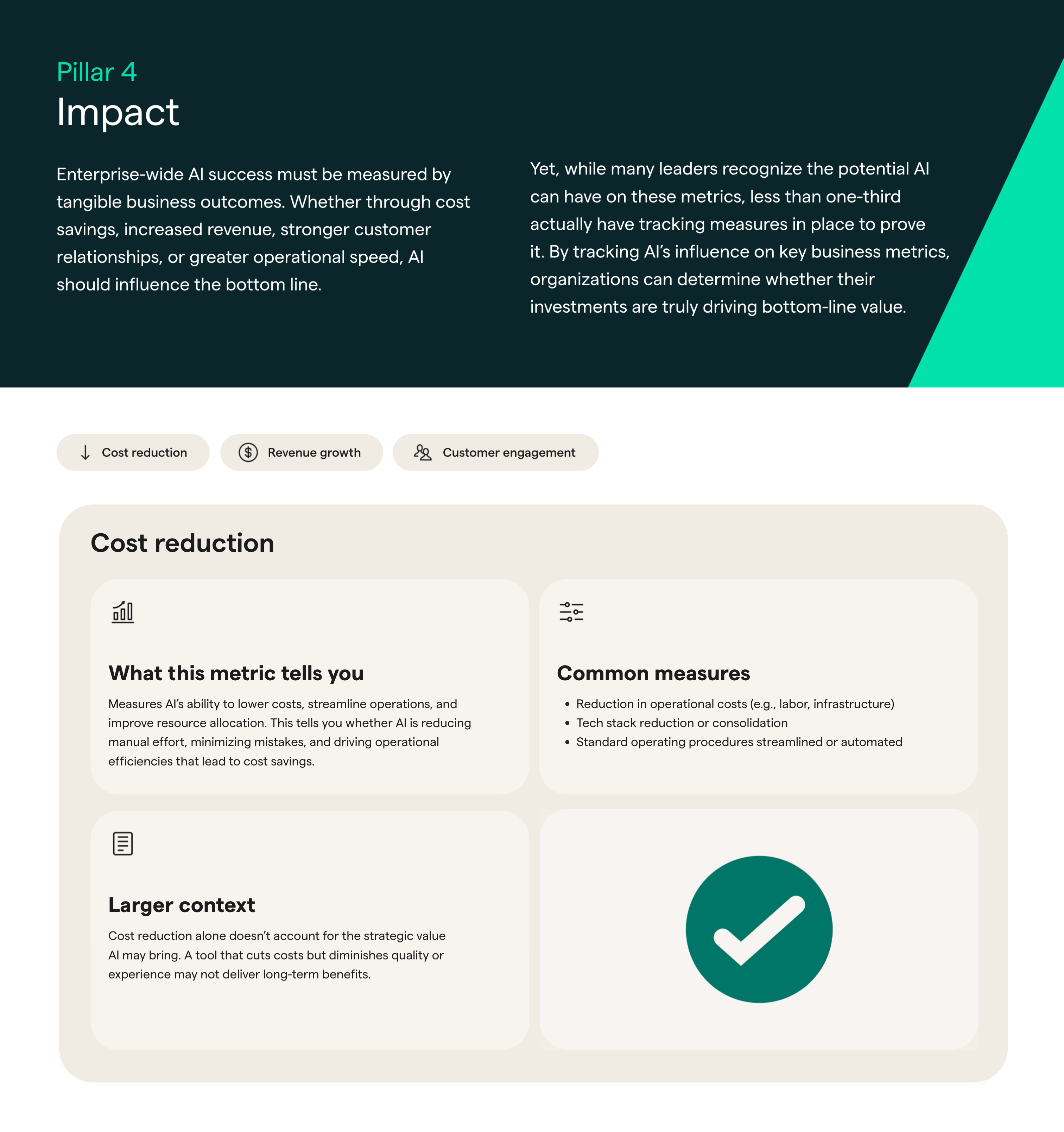
What readers experienced: a grid of KPI tiles that animate into place. Each tile contains one number, one line of context, and a small link that says what this really means. A short narrative connects signals to outcomes without drowning readers in spreadsheets.
How it was built: metric tiles, side drawers for deeper story, and contextual links that tie related ideas together.
Why it works: this pattern respects attention and precision at the same time. One insight per tile is enough to point the conversation in the right direction. The deeper drawer satisfies analysts who want to know how the number was formed.
The Quiet Conversion Engine Called Smart Gating
Forms have a reputation for killing good experiences. Smart Gating fixes that relationship by appearing only after meaningful value has been delivered. Grammarly used a simple flow.
- A reader engages with a high value section such as a slider, a deep dive, or the end of a chapter.
- A gentle panel invites the reader to unlock packaged takeaways or get a version customized for their role.
- Skipping is allowed and does not punish the reading rhythm.
Why it works: identity follows intent. When you create interactive reports that respect that order, conversion improves because trust is already in motion. It also lines up with modern privacy expectations and the value first posture of high intent audiences. It is a practical example of how Grammarly partners with Cleverstory to align value first reading with respectful identity capture.
Want this at your company? Use the same build kit or get a customized one. No code. Measurable from day one.
Measuring What Actually Resonates
You cannot iterate on what you cannot see. Once the report launched, Grammarly used Footprints analytics inside Cleverstory to watch behavior and respond to it.
- Time on section showed where readers slowed down to think.
- Heatmaps revealed re reads, which are usually the reference moments people revisit before they share.
- UTMs stitched source to behavior so distribution channels could be compared by intent, not just by clicks.
- CRM connections tied touchpoints to opportunities. That allowed the team to talk about pipeline influence with clarity and credibility.
Edits followed the data. A definition was tightened. A slider handle was made larger on mobile. A gate trigger moved a little deeper into the chapter. A cross link was added where readers seemed to hesitate. This is the product mindset applied to content, and it is why interactive reports keep getting better after launch rather than going stale.
The workflow reflects how Grammarly partners with Paperflite, where content engagement cleanly rolls into CRM and pipeline reporting.
Distribution That Multiplies Reach
A strong experience becomes a stronger campaign when it is packaged for the places people actually discover and discuss content.
- Share ready tiles for social and newsletters with a short title, a stat, and a direct link back to a chapter.
- Embeddable sections for internal wikis and partner spotlights so the best parts travel easily.
- Audience variants with lighter or richer gating depending on the context.
- One link packs with UTM tags for SDRs and field teams so links are distribution ready without handholding.
Cleverstory makes the report portable, not just publishable. That portability is what turns one launch into an always on asset the team can reference for months.
Directional Outcomes You Can Feel Even Without Public Numbers
Not every team can share exact metrics. The shape of behavior still tells a clear story.
- Completion went up because the journey felt short and guided.
- Form conversion improved because the gate appeared after value, not before it.
- Repeat visits increased, especially to the pillars and the business impact tiles.
- Share rates improved because the report provided linkable moments rather than giant pages.
Attribution stayed clean. Footprints captured engagement. UTMs captured source. CRM recorded campaign and opportunity. Pipeline influence rolled up in a way a revenue team can defend with confidence. This is how digital interactive reports earn a seat in serious conversations about results.
Interactive Report Building Kit You Can Copy
Here is a practical way to build something similar on Cleverstory without derailing a sprint.
- Time to build. Measured in days for content and design. No engineering required.
- Blocks used. Tabs, sliders, accordions, metric tiles, side drawers, Smart Gating, Footprints. Favor reusable blocks so you can move fast.
- Performance and accessibility. Lazy loaded media, alt text for images, captions for motion, clear focus states for keyboard users, and readable contrast. If it helps, treat accessibility tasks as part of definition of done.
- Release plan. Ship a strong version one, watch Footprints, and adjust weekly. Aim for small, high impact edits, not big bang relaunches.
- Governance. Lock brand colors, type scales, and spacing in templates to avoid drift as you experiment. Treat the design system as a shared resource, not a hurdle.
If your goal is to create interactive reports that people finish, this is the blueprint.
Ready to ship an interactive report
A Deeper Look At The Interaction Patterns
If you want to audit your current report against Grammarly’s approach, use this checklist of patterns and the reasons they work.
- Promise first. The hero should tell a busy reader what they will get and why it matters in one or two short lines.
- Progress that reassures. A visible progress bar changes how people feel about time. It signals that the end is reachable.
- Tabs for complexity. Whenever you have three or more sub points, consider tabs to group them and reduce visual noise.
- Sliders for proof. If there is a before and after story, show it as a slider so the difference is felt, not just read.
- Drawers for depth. Hide deep context in side drawers so the main path stays clean. Make the drawer easy to close and always return the reader to their place.
- Tiles for metrics. Put one number and one line of context on each tile. Force yourself to explain what the number means in plain language.
- Smart Gating on momentum. Trigger the form after a moment of meaning. For example, after someone opens a deep dive, completes a chapter, or replays a slider a second time.
- Footprints for truth. Time on section and re reads are the closest thing to proof that your audience cares. Watch them closely.
- Share packs for scale. Build small share cards with a title, a stat, and a deep link. Make them available to social, email, and sales on day one.
- Weekly edits. Set a recurring calendar block to review analytics and edit. Give a small owner group the authority to push changes without ceremony.
A Short Swipe File For Your Next Interactive Report : Checklist
Use these lines as building blocks. They are intentionally plain and easy to adapt.
- What you will get today. A one sentence promise that frames the report.
- Why it matters now. A one sentence reason to keep reading.
- Show me. A five to ten second interactive moment that proves the claim.
- Let me choose. A tab set that lets readers pick the scenario that matches their world.
- Teach me fast. A short definition or note inside the section so there is no jargon tax.
- Keep me moving. A next best action at the end of every chapter.
- Invite me when I am ready. A polite Smart Gating panel triggered by momentum.
- Help me share. A card with a link I can paste. Do not make me hunt.
- Make it better next week. One obvious edit shipped every week.
- Tell me who made it. A credits section that builds trust in the work.
Grammarly provided the vision and editorial craft. Harris Poll anchored the methodology. Paperflite built Cleverstory, the no code canvas that made this report interactive and measurable, with Smart Gating and Footprints at the core. Built as a Grammarly partnership with Cleverstory by Paperflite, with Grammarly leading the narrative and Harris Poll providing the research backbone.
Explore the Grammarly interactive report in our Fall in Love series and see the patterns in action.
FAQs
What is an interactive report?
An interactive report is a digital content experience that lets readers explore information through chapters, tabs, sliders, accordions, and other controls. It replaces long static pages with short, focused beats that readers can skim or dive into. Interactive reports also include analytics that show what sections resonate and which channels drive intent. When built well, they feel more like a product than a document.
How do you create interactive reports without code?
Use a no code platform like Cleverstory. Start with your outline, convert each idea into a chapter, and add micro interactions such as tabs or a before and after slider. Configure Smart Gating so forms appear after value is delivered. Connect Footprints analytics, UTM tags, and your CRM so engagement ties to pipeline. This approach shows how to make interactive reports that drive completion and conversion without engineering time.
Are interactive annual reports good for SEO?
Yes, when built correctly. Interactive annual reports can improve engagement metrics like time on page and completion rate, which are strong behavioral signals. Use clean HTML, meaningful headings, descriptive alt text, and lazy loaded media. Publish a clear URL structure and add schema for Article or FAQ where appropriate. Include internal links to related Cleverstory examples and product resources so readers can continue deeper into your site.
What are examples of interactive reports that work?
Look for patterns such as chaptered journeys with visible progress, value first Smart Gating, before and after sliders for proof moments, and metric tiles for quick insight. Grammarly reports created on Cleverstory are a strong reference. They demonstrate interactive report examples that turn abstract ideas into memorable, tactile moments and keep readers moving from one useful section to the next.
How do interactive digital reports improve lead generation?
Interactive digital reports convert better because identity follows intent. When readers engage with valuable sections first, they are more willing to fill a form that offers a packaged takeaway or a personalized follow up. With Footprints analytics and UTM tracking, you can attribute sections and sources to opportunities in your CRM. That creates a measurable loop from content to pipeline and makes it easier to prioritize future investments.